Beautiful Color Schemes for Family Photos This Spring
Any day, the temperatures will be warmer, the days will be brighter, and all of nature’s colors will be on display. When spring comes around, it’s a photographer’s dream and families can enjoy shiver-free outdoor sessions! As you plan your family’s outfits for your photos, I encourage you to tie in some fun hues with accessories and accents. Here are some of my favorite color schemes for family photos this spring.
A Little Bit About Color Psychology
Before we talk about colors for this spring’s family photos, let’s chat about color psychology first. Don’t worry. We’re not going to get all Psych 101 here. Just the basics! Color psychology studies how different colors impact human feelings and behaviors. You’ve heard about seeing red, or how purply and royalty go hand in hand, right? Well, those sayings are rooted in color psychology.
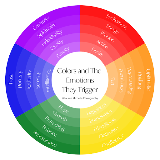
Viewing colors can impact and influence our state of mind, as each color brings about different emotions. People and businesses use color psychology in everything from advertising and marketing to home decor and fashion! So, the psychology behind my favorite color schemes for family photos this spring plays a big part in why I’m sharing these ones today.

This is one of my color theory exploration paintings from art school!
Take a look through these colors and see which ones bring about the aesthetic you’re hoping for in your family’s photos! And, if you spot a color you love, check out this selection of spring outfits in some of these colors!
Color Schemes for Family Photos This Spring
As you plan your outfits for your family photos, I suggest incorporating these beautiful hues as accents and accessories for your neutral-based clothing. Neutrals are timeless, classic, and pair wonderfully with any background and setting. Adding in fun colors with subtle and stylish ties, scarves, shoes, and belts, among others, brighten your palette and evoke emotion, without overwhelming your images.

Now, let’s get into the colors!
Glacier Lake: Calm & Serene
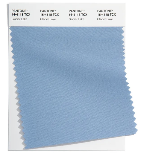
Shades of blue tend to suggest confidence and stability. PANTONE 16-4118, Glacier Lake, does just that. This gorgeous hue is cooling, serene, and conveys quietude - something you might not always associate with family photos!
But, consider the finished images you can expect when your family coordinates in clothing featuring pops of this color. You can expect them to bring about feelings of calm and tranquility (even if we know the behind-the-scenes were a bit more exciting than that!)
Skydiver: Inspiring

Speaking of beautiful shades of blue! The fantastic thing about colors is that two hues within the same color family can evoke different emotions. I mentioned that Glacier Lake’s blue suggests confidence, and with PANTONE 19-4151, Skydiver, you might feel inspired.
Skydiver’s subtle, bold tone makes you dream about what’s possible. I love seeing this in color schemes for family photos with young and growing families embracing the adventure of life together. It’s perfect for a nice neck or bowtie for the men in your family, and a pretty pop of color for women’s scarves or shoes!
Gossamer Pink: Soft & Light

A classic soft pink is a favorite pick of mine for romantic and feminine photos. PANTONE 13-1513, Gossamer Pink, is the perfect shade to weave into your wardrobe for maternity and newborn sessions. Its tender and light tone is ideal for sweet moments expecting a baby or snuggling them after they arrive!
This shade is also charming for a hint of romance, and would be great worn by one or both parents while I capture a chapter of their love story. Picture it showing up in flattering florals!
Innuendo: Love and Luxury
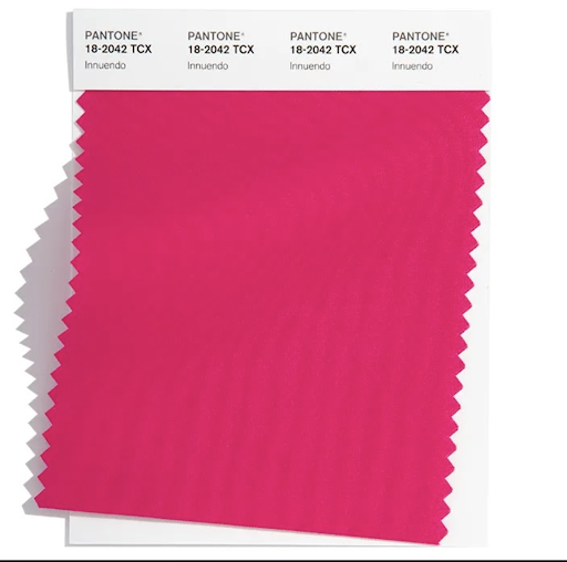
PANTONE calls color 18-2042, Innuendo, “tantalizing,” and I have to agree! This spicy pink is bold, bright, and vibrant. I can’t think of a prettier color to sprinkle into color schemes for family photos this spring.
This pink suggests passion and maturity, and yes, a little innuendo. Whether you choose to wear jewelry, a blouse, or even shoes in this fiery pink, it’s sure to say you’re confident and full of love.
Very Peri: Uplifting and Creative (And 2022 Pantone Color of The Year!)

Warm and cool at the same time, Veri Peri (Pantone 17-3938) strikes a balance of calm and collected and energetic energy. It’s a violet shade that is sophisticated while also fun!
Very Peri is the kind of color that will never feel like it’s “too much.” So whether you decide to wear jewelry in this hue or dress your daughter in a cute bow with it — or, give it a little more shine with a blouse under your sweater — Very Peri will always look just right.
Daffodil: Joy and Spontaneity

Seriously, what says “spring” better than a lively, warm, and daring yellow? Pantone’s “Daffodil” (14-0850) perfectly captures happy and festive spring vibes. This sunshine color stirs joy and spontaneity and will make you imagine spring gardens and thriving flora.
If you’re hesitant to wear more eye-catching and striking colors like this one but are considering it in color schemes for family photos, don’t fret! Daffodils are eye-catching in large accessories and small alike. However you incorporate it in your photos, it can make a statement as strong or subtle as you want.
Schedule Your Next Family Photo Session!
Ready to head outside for warm weather photography with your family? Contact me to learn about my services and how I can help you document your family’s unique and authentic story.